Trust first, account last.
Booking care services online shouldn’t feel risky for older adults. SeniorCare Plus builds trust before it asks for anything.
- Type
- Mobile and tablet app · New product (fictional brief)
- Context
- Team project (3 designers) · UX/UI Design, Mediadesign Hochschule · Apr – Sep 2026
- Role
- UX/UI Designer · My focus: UI design for onboarding, profile, SMS verification, help and the tablet adaptation
- Tools
- Figma · Miro
- 2 personas → 8 design decisions
- Mobile + tablet prototype
01Overview
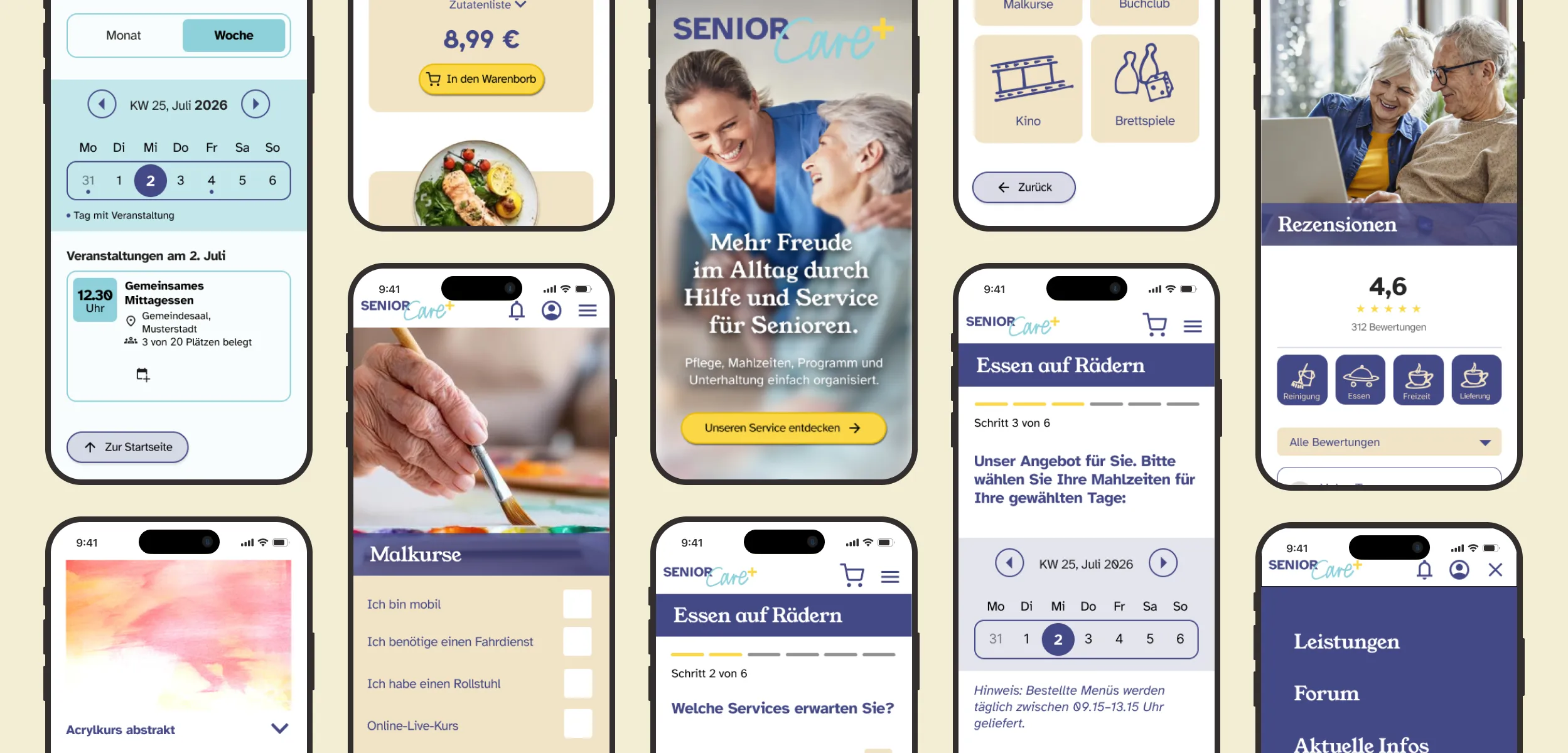
SeniorCare Plus is a mobile and tablet app that makes senior care services easy to find and book: meal delivery (“Essen auf Rädern”), activities, news and reviews. It is designed for older adults and their families.
The problem
Older users often struggle with digital services: small text, unclear navigation and long sign-up forms. Many don’t trust booking online at all. The goal was an app they could use confidently, without help.
02Research
We started with user interviews, then built an empathy map, two personas, user flows and a sitemap.

Active and curious, but has never booked a service online and is afraid of being scammed. Needs proof before booking.

Wants to stay independent, has little internet experience, often forgets passwords and prefers calling to filling in forms.
Shared fears
- Not trusting the website
- Pressing the wrong button
- Getting lost in long processes
Empathy map
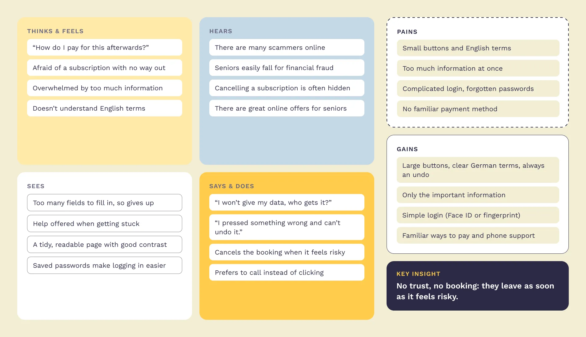
We mapped all interviews in one shared empathy map. Leo and Hilde have different habits, but the same fears: scams, hidden subscriptions and pressing the wrong button.
Sitemap
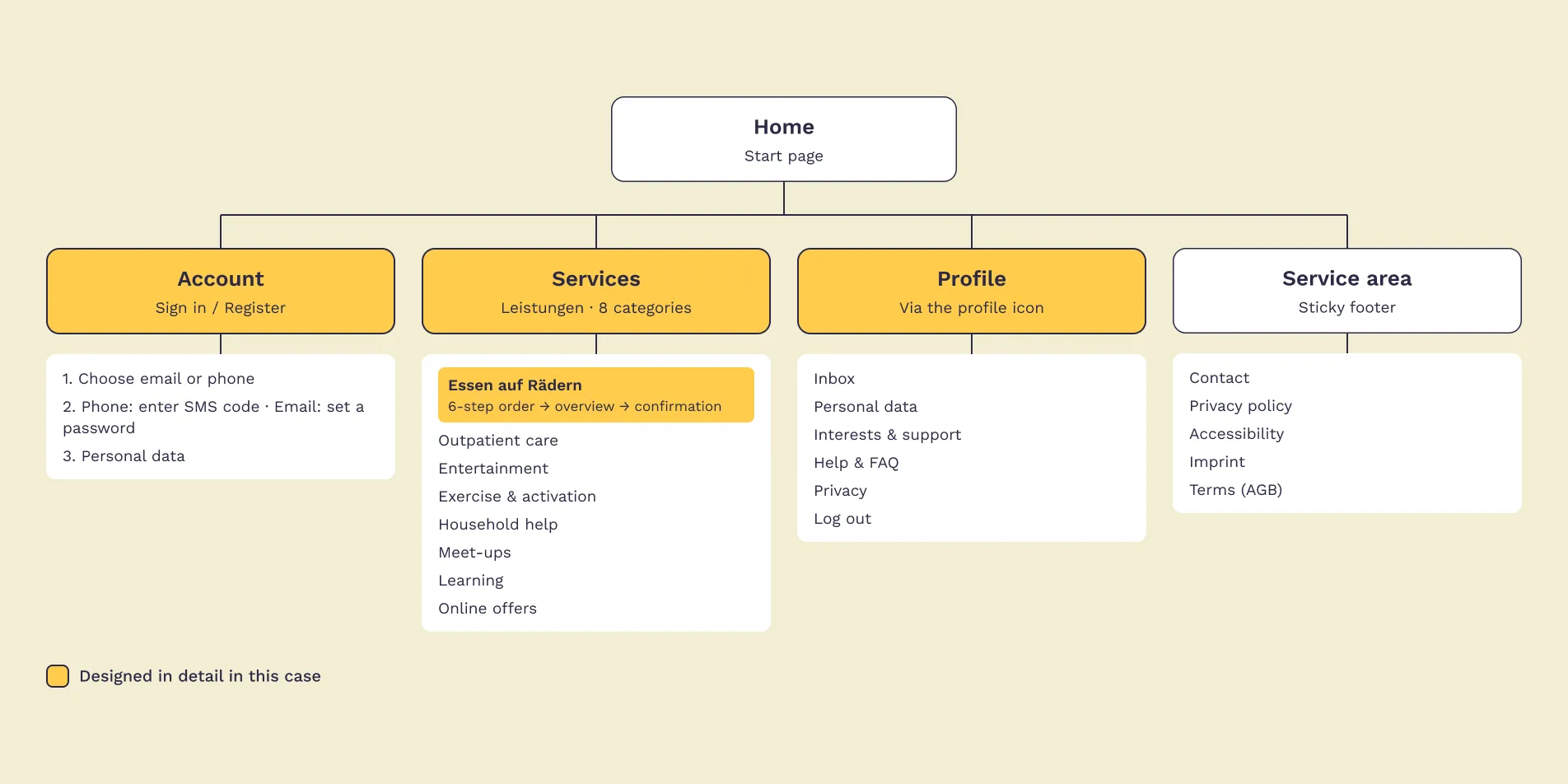
A flat structure with few levels. Help, contact and accessibility are always one tap away, through the profile and the sticky footer.
03Insights → decisions
Every decision answers one of these fears.
- Trust firstReviews filtered by service, a quality certificate and an “About us” page with real numbers.
- Book first, register laterNo account needed to start. Account creation comes after the booking is confirmed.
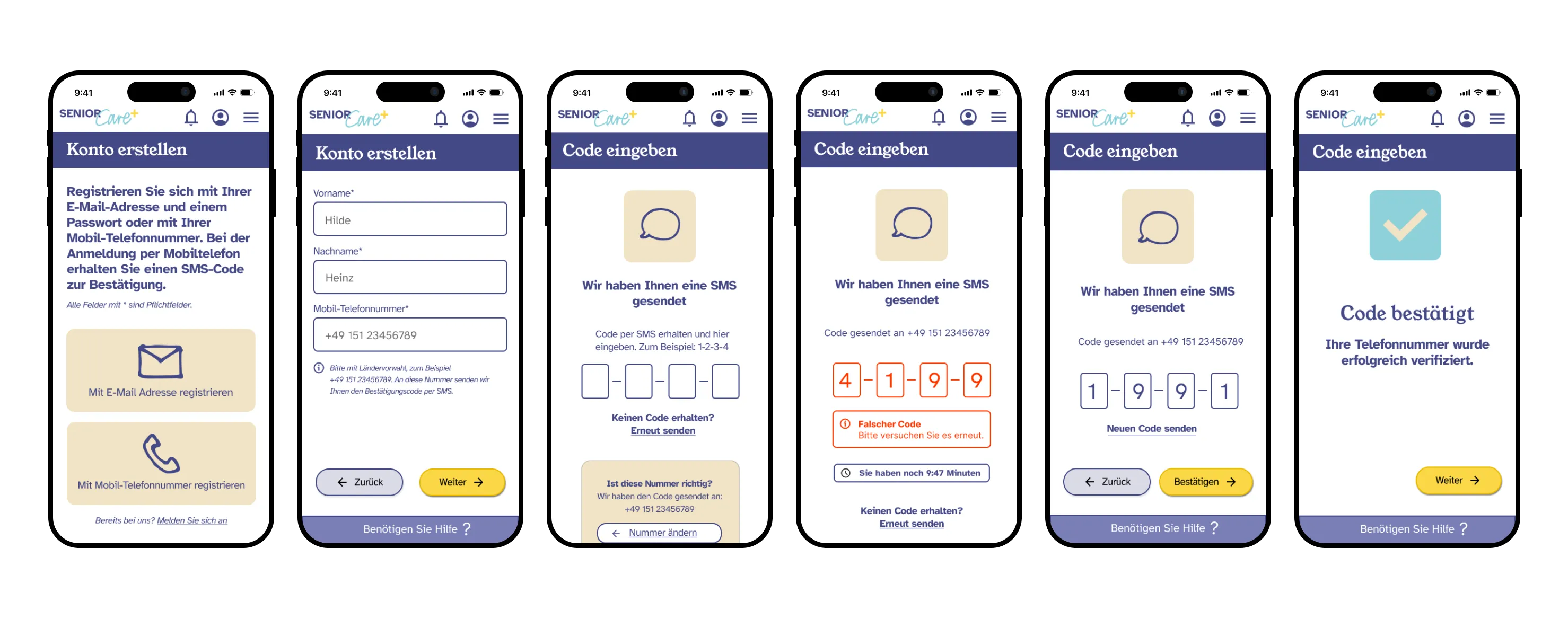
- Passwords optionalSign up by phone with an SMS code, no password needed. Email works too, and users stay logged in.
- Familiar paymentPay in cash on the spot or by card. No online payment needed.
- No fear of mistakesA back button on every step and a confirmation before cancelling, so no data gets lost.
- Help always visibleA “Need help?” bar with a phone number on every screen.
- Accessibility on every screenAdjustable text size, contrast mode, read-aloud and the Atkinson Hyperlegible typeface.
- Clear languagePlain, formal German (“Sie”), no English terms.
04Design
Step-by-step order
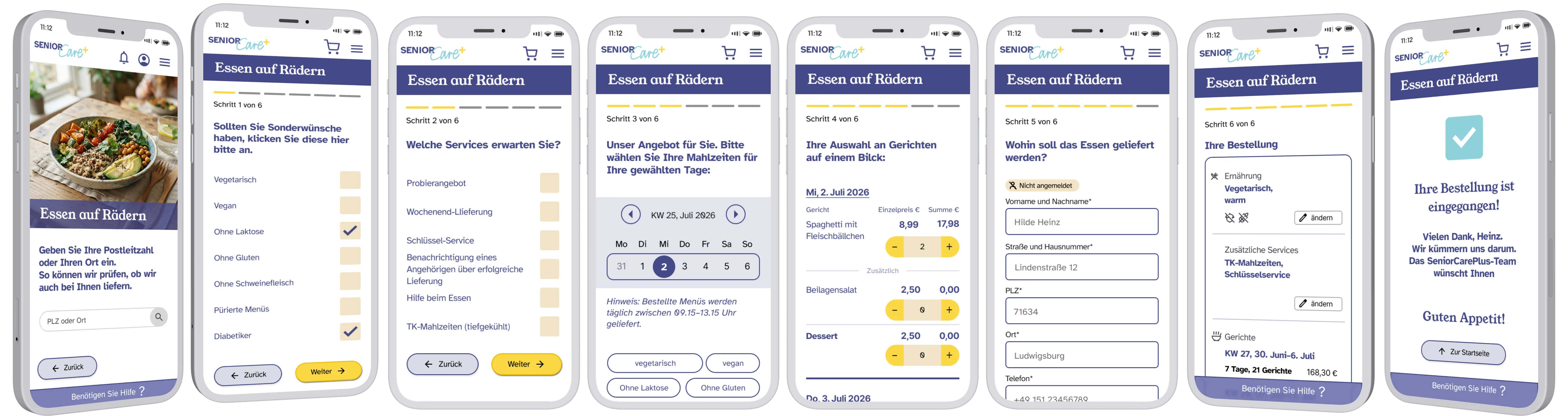
We designed the order for “Essen auf Rädern” together as a team, directly in the final UI. Users first check if delivery is available in their area. Then six steps, one question each: dietary needs, extra services, meals for the chosen days, a meal overview, delivery details, and a summary with payment. A thank-you screen confirms the order.
SMS verification for older users
A 10-minute code expiry instead of the usual short timer, clear error and expiry states, and an easy way to correct a wrong phone number.
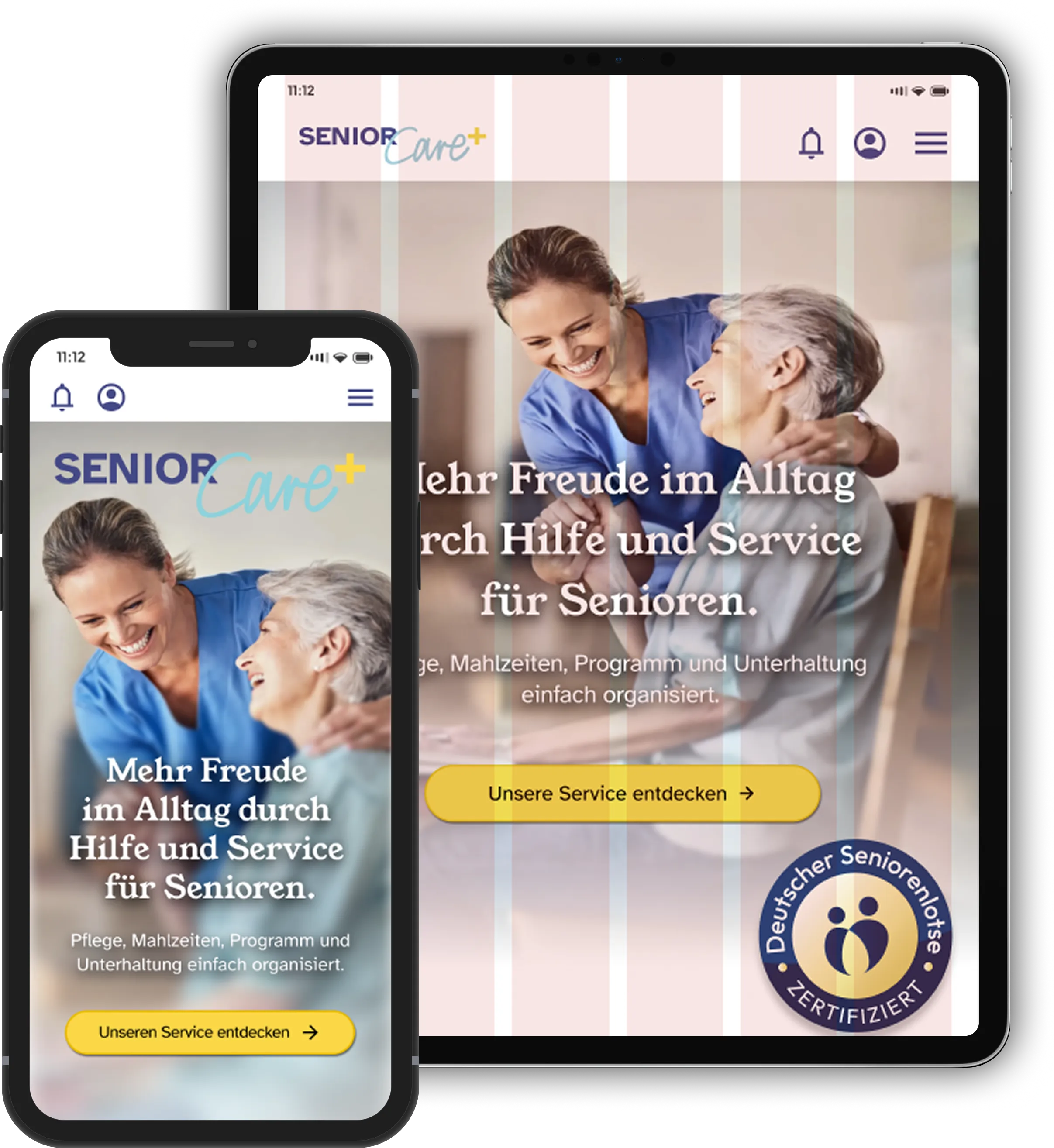
Tablet adaptation
6-column grid (32 px margins, 20 px gutters), accessibility icons first in the footer, and a two-column meal selection.
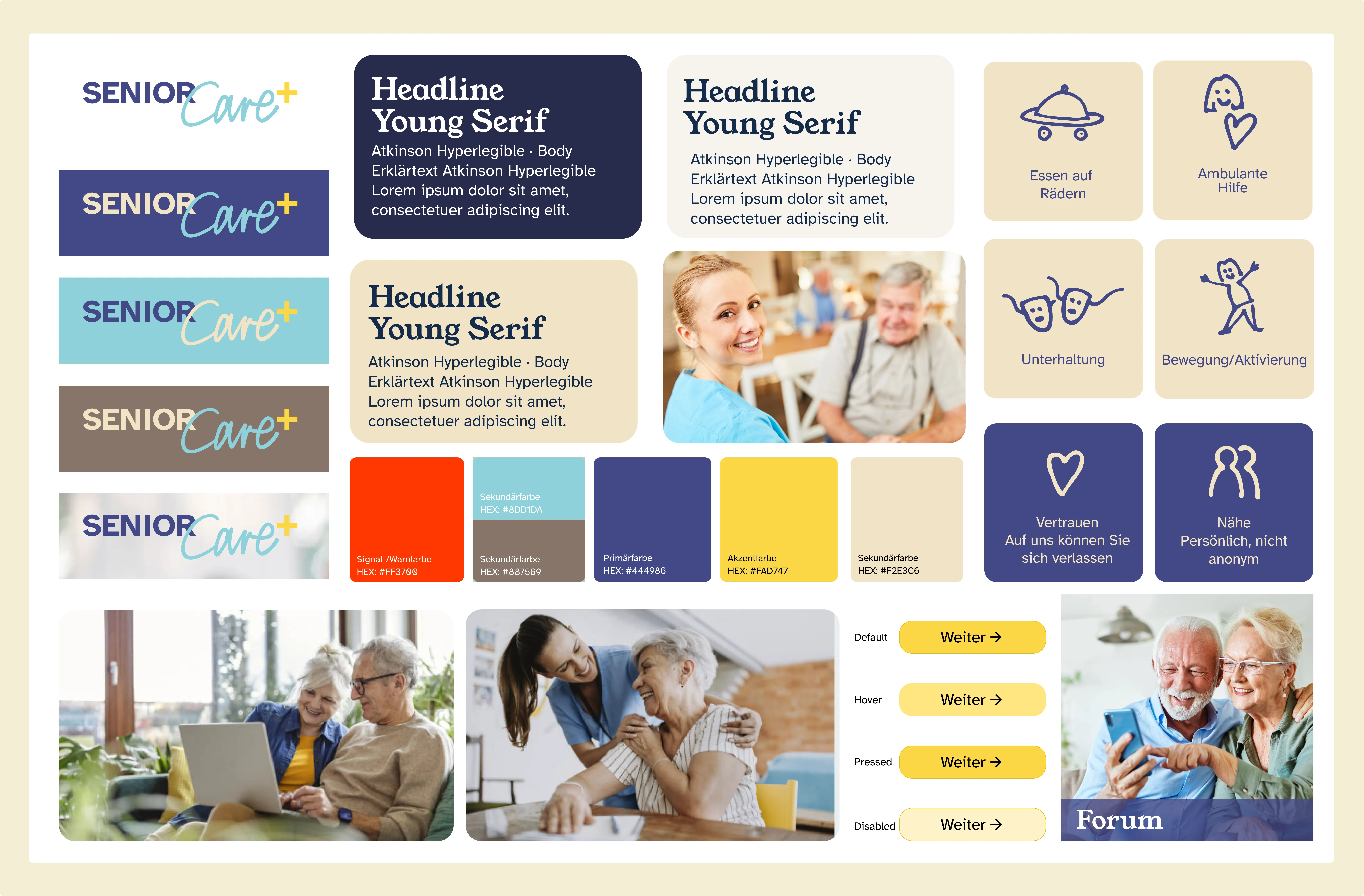
Design system
A documented design system with components and naming agreed on early by the team. Colors: purple as primary, yellow as accent, light blue, taupe and beige as secondary colors, and orange for warnings. Typefaces: Young Serif for headlines and Atkinson Hyperlegible for body text, designed for low-vision readers.
05Feedback & iteration
We tested the prototype with our instructors during the course and iterated on their feedback.
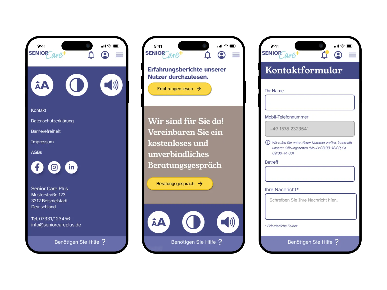
Accessibility & help
There were no accessibility controls and no direct way to get help.
Three large accessibility buttons in the footer, a free consultation call, and a “Benötigen Sie Hilfe?” bar on every screen, so help is always one tap away.
Notifications
Older users may miss messages sent through other channels.
Important messages also appear in the app’s notification bell, so nothing gets lost.
06Final solution
An interactive prototype for mobile and tablet, a documented design system and a developer handover package with specifications for all key screens.
In the video, a user checks what others say and who is behind the service before booking a painting course.
- Read reviews from other users
- Check the “About us” page
- Book a painting course
07Learnings
- Designing for older users showed me that trust and clarity matter more than features.
- Every extra step or unclear label can make someone give up.
- In a team, agreeing on components and naming early keeps the design consistent.