SeniorCare Plus
A mobile and tablet app that makes senior care services accessible and easy to use.
SeniorCare Plus is an app for older adults and their families. It lets them order services like meal delivery ("Essen auf Rädern"), stay up to date with news and read reviews. All in a simple, accessible interface.
Role: UX/UI Designer (team project)
Context: UX/UI Design course, Mediadesign Hochschule
Duration: April– September 2026]
Tools: Figma, Miro
Older users often struggle with complex apps: small text, unclear navigation, long sign-up forms. Our goal was to design an app they could use confidently, without help.
The challenge
Process
We started with research: an empathy map and two personas based on the needs of older users. Then we mapped user flows and a sitemap, built low-fidelity wireframes and developed them step by step into the final UI. I was mainly responsible for the wireframes, covering onboarding, profile, SMS verification, help and the ordering process.


Leo (78) is active and curious, but has never booked a service online and is afraid of being scammed. Hilde (82) wants to stay independent, has little internet experience, often forgets her passwords and prefers to call instead of filling in forms.
Trust first: reviews, a quality certificate and an "About us" page with real numbers, because Leo needs proof before he books.
Book first, register later: no account needed to start, so the sign-up never becomes a barrier.
Simple, secure sign-up: SMS verification keeps it safe without making it complicated, which matters to Leo, and doesn't rely on remembering passwords, which matters to Hilde.
Familiar payment options: cash at the course or bank transfer, no credit card required.
No fear of mistakes: a back button on every step and a confirmation before cancelling, so users never lose their data by accident.
Help always visible: a "Need help?" bar on every screen with a phone contact, for users who prefer to call.
Accessibility on every screen: text size, contrast and read-aloud, plus the Atkinson Hyperlegible typeface.
Clear German, no anglicisms: plain language for users unfamiliar with English terms.
Both personas shared the same fears: not trusting the website, pressing the wrong button and getting lost in complex processes. Every key decision responds to that:
Key design decisions
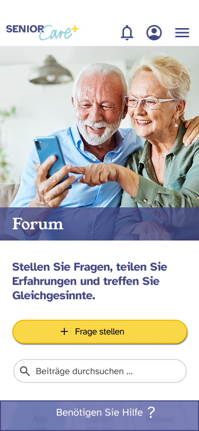
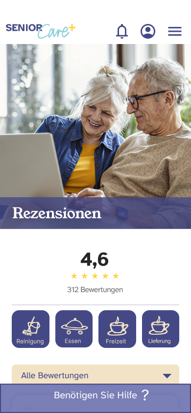
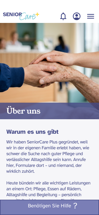
Trust-building screens: community forum, quality certificate, reviews filtered by service and our story.
An interactive prototype for mobile and tablet, a documented design system and a developer handover package with specifications for all key screens.
Outcome
Designing for older users taught me that trust and clarity matter more than features. Every extra step or unclear label can make someone give up. Working in a team also showed me how important it is to agree on components and naming early, so the design stays consistent.