banda
A web app that helps volunteers in Santa Fe organize workshops, share knowledge and support each other.
banda is a platform for volunteers working with associations in Santa Fe, Argentina. It brings together everything they need to run workshops: materials, coordination, content planning and a shared space to exchange experiences.
The project builds on my earlier research at the Universidad Nacional del Litoral (Argentina), carried out with a Cientibeca research scholarship. As part of that research, I studied how associations and volunteers in Santa Fe share techniques and workshop processes, but the work stayed at the research stage. With banda, I turned those findings into a product.
Role: UX/UI Designer (individual project, end-to-end)
Context: UX/UI Design course, Mediadesign Hochschule
Background: Cientibeca research project, Universidad Nacional del Litoral
Tools: Figma, Miro
Volunteers organize workshops with little time and few resources. Knowledge about materials and techniques gets lost, and coordination happens through scattered chats. The goal was a simple tool that helps them work together and feel part of a community.
The challenge
Process
I started by revisiting the interviews from my earlier research, analyzed them again, built an empathy map and created personas to understand the volunteers’ needs today. From there I defined four core areas: material organization, volunteer coordination, workshop planning, and a knowledge bank for sharing experiences.
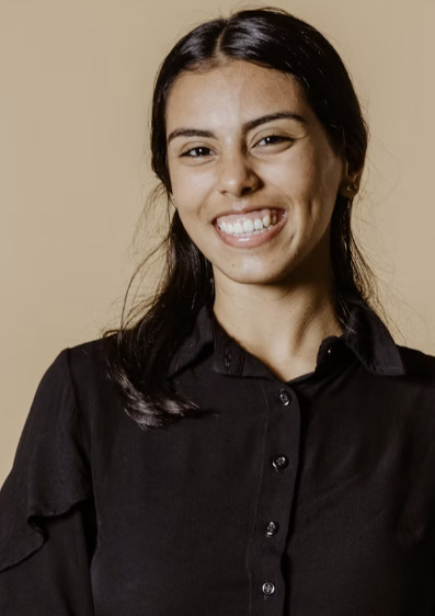
Sofía & Tomás, 21 / 24 · Students
“I help a few hours a week, whenever I have time next to my studies.”
Need flexible schedules and clear information about activities and materials.

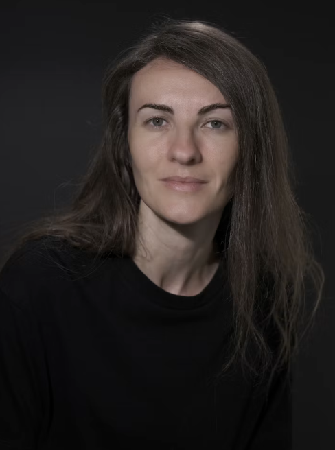
Lucía, 34 · Coordinator
“We don’t give workshops – we make them together with the kids.”
Leads a team of 20 volunteers. Needs an overview of materials and reliable communication.
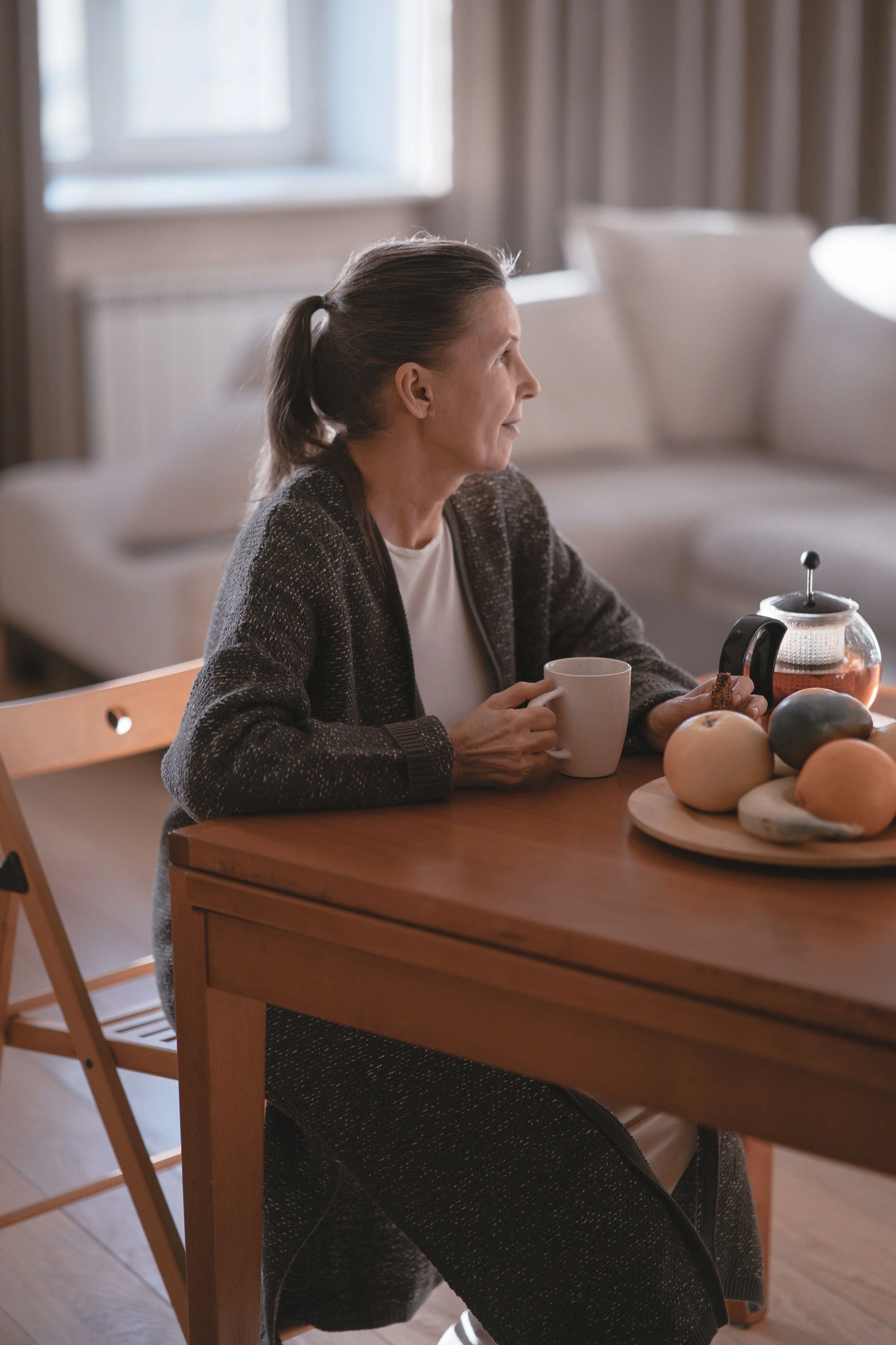
Marta, 58 · Retired
“My kids are grown up – now I have time to do something for others.”
Needs simple, large controls and clear instructions.
This led to four design principles:
Little time: every action has to be quick.
No obligation: the app should motivate, not pressure.
No conflict: there is no open chat.
Human warmth: the app should feel warm and friendly.
Read more about the original research: https://www.carlabeherens.com/projects/design-resilience-urban-systems
Progressive Web App instead of a native app: no app store costs and no installation, so the platform can be shared via a link, for example from the city’s website.
Focus on the volunteer, built for community: every feature supports the individual volunteer but also connects them with others.
Clear workshop statuses: Draft, Open, In discussion and Approved, so everyone knows where a workshop stands. Volunteers can save incomplete ideas as a draft.
A name that means “us”: in Argentine Spanish, banda means “your group, your people”, which reflects the sense of belonging the platform wants to create.
Key design decisions
Design system
A design system built from scratch to keep the platform consistent, warm and easy to scale. It starts with the brand.
Logo
The logo shows a person surrounded by circles, symbolizing how the community holds and supports each volunteer. The rounded wordmark keeps it friendly and approachable.
Mascots
I designed a family of illustrated characters inspired by the native wildlife of the Paraná river around Santa Fe: a capybara, a lizard and an hornero, the bird known for building its nest from mud. They appear at key moments, like confirmations, tips or empty states, to make the app feel warm and human, one of our four design principles. The capybara, calm and sociable, is the main companion.
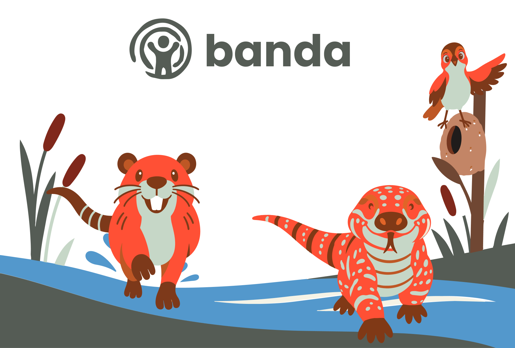
Colors: a warm palette with clear roles: orange (#FF5035) for primary actions, green (#5CAA86) as secondary, terracotta (#BF6658) for warm surfaces, plus a light and a dark neutral.
Typography: Lato, friendly and highly readable.
Components: buttons, cards, status tags, forms and navigation, each with their states.
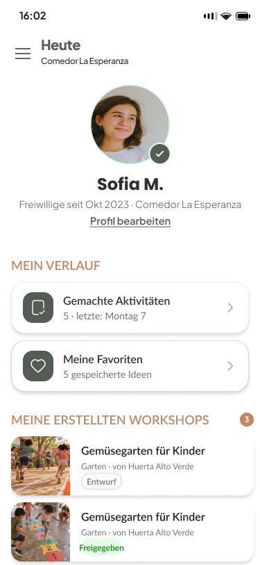
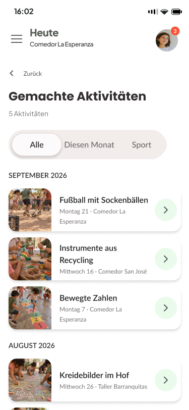
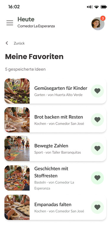
An interactive prototype and a documented design system, presented at the end of the course.
Outcome
What I learned
Going back to research I did years ago showed me how much a solid research base makes later design decisions easier, and how needs can change over time. Building a design system from scratch taught me to think in reusable components from the start, not at the end. And designing for such different users, from students to retirees, taught me that sometimes the best decision is what you leave out, like an open chat.